ChatGPT App Display Mode Reference (April 2026)
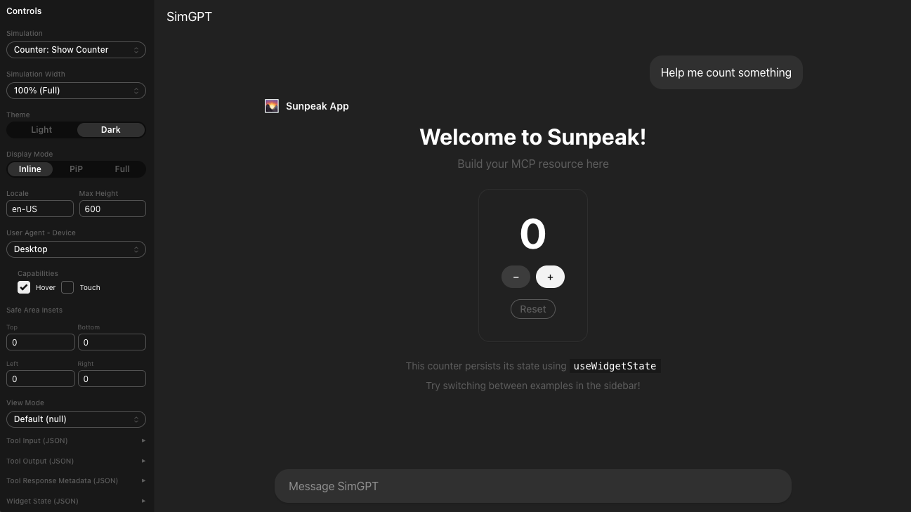
ChatGPT App in inline display mode on wide screen.
The MCP Apps specification defines three display modes for MCP Apps, but it doesn’t document the exact HTML and CSS that ChatGPT uses to render each one. That matters when you’re debugging layout issues or trying to understand why maxHeight works in one mode but not another. This post covers the exact layout for each mode, with the real DOM structure straight from ChatGPT.
TL;DR: Inline and fullscreen modes ignore maxHeight; only PiP uses it. PiP falls back to fullscreen on mobile. Resources can be arbitrarily tall in all modes. Use useDisplayMode() from sunpeak to read the current mode and adapt your layout.
Inline Display Mode
Inline display mode inserts your ChatGPT App resource in the flow of the conversation. Your app iframe sits inside a container that looks like this:
<div class="no-scrollbar relative mb-2 @w-sm/main:w-full mx-0 max-sm:-mx-(--thread-content-margin) max-sm:w-[100cqw] max-sm:overflow-hidden overflow-visible">
    <div class="relative overflow-hidden h-full" style="height: 270px;">
     <iframe class="h-full w-full max-w-full">
         <!-- Your App -->
     </iframe>
    </div>
</div>
The height of the outer div is fixed to the height of your resource. I tested resources up to 20,000 pixels tall and they all render correctly. The maxHeight value from the host context is undefined in inline mode, which means your resource height is the only constraint.
This makes inline mode the simplest to work with. Your resource appears at whatever height you set, scrolling with the conversation like a normal message.
Fullscreen Display Mode
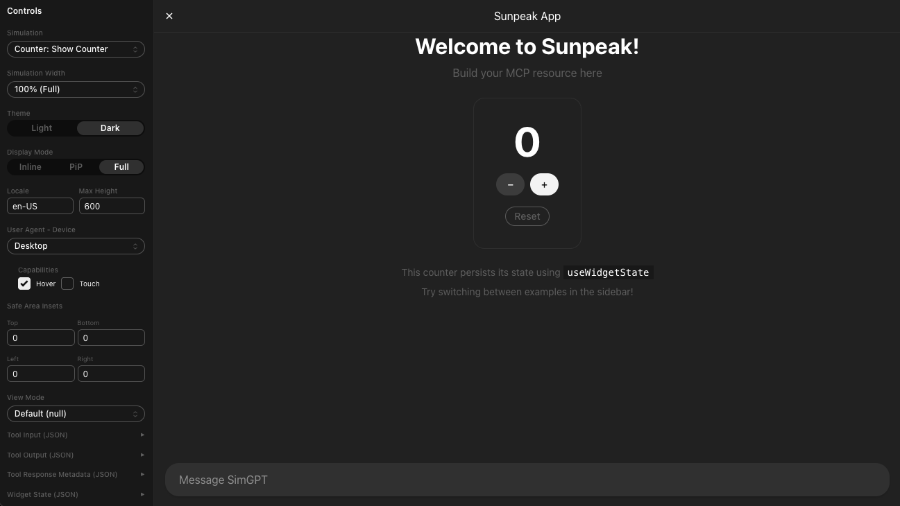
Fullscreen display mode takes up the full conversation space, below the ChatGPT header. The header converts to show your application title centered with an X button to exit. The DOM structure:
<div class="no-scrollbar fixed start-0 end-0 top-0 bottom-0 z-50 mx-auto flex w-auto flex-col overflow-hidden">
    <div class="border-token-border-secondary bg-token-bg-primary sm:bg-token-bg-primary z-10 grid h-(--header-height) grid-cols-[1fr_auto_1fr] border-b px-2">
        <!-- ChatGPT header / nav -->
    </div>
    <div class="relative overflow-hidden flex-1">
        <iframe class="h-full w-full max-w-full">
         <!-- Your App -->
        </iframe>
    </div>
</div>
Like inline mode, maxHeight is undefined and unused. Resources can be any height. The flex-1 on the iframe container means your app fills all available vertical space below the header automatically. If your content is shorter than the available space, the extra space is empty. If it’s taller, it scrolls within the container.
Fullscreen is ideal for dashboards, editors, data tables, and anything that benefits from maximum screen real estate. Your resource doesn’t need a close button since the host provides one in the header.
Picture-in-Picture (PiP) Display Mode
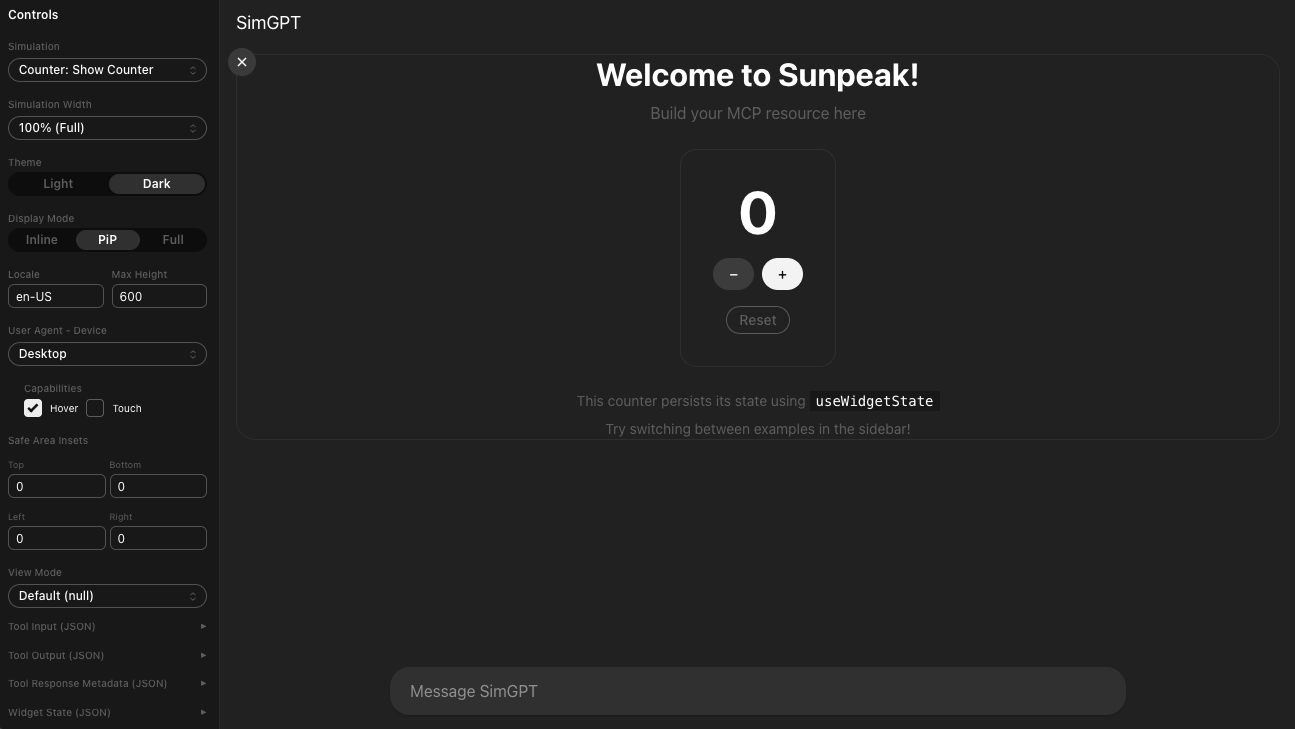
PiP display mode positions your ChatGPT App as a floating window above the conversation. The DOM:
<div class="no-scrollbar @w-xl/main:top-4 fixed start-4 end-4 top-4 z-50 mx-auto max-w-(--thread-content-max-width) sm:start-0 sm:end-0 sm:top-(--header-height) sm:w-full overflow-visible" style="max-height: 480.5px;">
    <div class="relative overflow-hidden h-full rounded-2xl sm:rounded-3xl shadow-[0px_0px_0px_1px_var(--border-heavy),0px_6px_20px_rgba(0,0,0,0.1)] md:-mx-4" style="height: 270px;">
     <iframe class="h-full w-full max-w-full">
         <!-- Your App -->
     </iframe>
    </div>
</div>
This is the only display mode that uses the maxHeight constraint from the host context. Notice the style="max-height: 480.5px" on the outer container. Your iframe can be any height it wants, but content scrolls within that maxHeight window. The PiP window will not expand beyond it.
PiP also gets rounded corners and a shadow that inline and fullscreen don’t have, which gives it the floating card appearance.
One important detail: PiP is not supported on mobile screen widths. ChatGPT falls back to fullscreen display mode when a PiP resource is viewed on a small screen. This is a host implementation choice, not a protocol requirement, so other MCP-compatible hosts could handle mobile PiP differently.
Reading Display Mode in Code
Use the useDisplayMode hook to read the current display mode and adapt your layout:
import { useDisplayMode } from 'sunpeak';

function MyResource() {
  const displayMode = useDisplayMode(); // 'inline' | 'pip' | 'fullscreen'

  return (
    <div style={{ height: displayMode === 'fullscreen' ? '100vh' : 'auto' }}>
      {/* Adapt layout based on mode */}
    </div>
  );
}
The hook updates reactively when the host changes the mode, so your component re-renders automatically. If you need to request a mode change (like an “expand to fullscreen” button), see requesting display mode transitions.
Quick Reference
| Property | Inline | Fullscreen | PiP |
|---|---|---|---|
maxHeight | Not used | Not used | Applied |
| Height constraint | None (resource height) | None (fills available space) | Scrolls at maxHeight |
| Mobile behavior | Same | Same | Falls back to fullscreen |
| Rounded corners | No | No | Yes |
| Close button | None | Host provides | Host provides |
| Position | In conversation flow | Fixed, full area | Fixed, floating above |
Testing Display Modes
You can toggle between all three display modes in the sunpeak inspector without deploying to ChatGPT or using a paid account. Run pnpm dev and use the display mode dropdown in the inspector sidebar.
For automated tests, pass displayMode to inspector.renderTool to verify your layout renders correctly in each mode:
import { test, expect } from 'sunpeak/test';

const modes = ['inline', 'pip', 'fullscreen'] as const;

for (const displayMode of modes) {
  test(`resource layout adapts to ${displayMode}`, async ({ inspector }) => {
    const result = await inspector.renderTool('my-tool', undefined, { displayMode });
    const app = result.app();

    // Verify mode-specific layout
    if (displayMode === 'fullscreen') {
      await expect(app.locator('[data-testid="expand-btn"]')).not.toBeVisible();
    } else {
      await expect(app.locator('[data-testid="expand-btn"]')).toBeVisible();
    }
  });
}
These tests run locally and in CI with no ChatGPT account required. The sunpeak inspector processes display mode changes the same way a real host does, so your tests match production behavior. See the complete testing guide for the full Playwright setup.
Get Started
npx sunpeak new
Further Reading
Frequently Asked Questions
What are the three ChatGPT App display modes?
ChatGPT Apps (built as MCP Apps) support three display modes: inline (embedded in the conversation flow), fullscreen (takes up the full screen below the host header), and picture-in-picture or PiP (positioned absolutely above the conversation as a floating window). These display modes are defined in the MCP Apps specification and apply to any MCP-compatible host, not just ChatGPT.
How does inline display mode work in ChatGPT Apps?
Inline display mode embeds your ChatGPT App directly in the conversation flow as a message. The iframe container has a fixed height matching your resource height. There is no maxHeight constraint, and resources can be arbitrarily tall. Use the sunpeak inspector to test inline mode locally without a ChatGPT account.
How does fullscreen display mode work in ChatGPT Apps?
Fullscreen display mode takes over the entire conversation space below the host header. The header shows your app title with an X button to exit. Like inline mode, there is no maxHeight constraint and resources can be any height. sunpeak lets you test fullscreen mode instantly with pnpm dev.
How does picture-in-picture (PiP) display mode work in ChatGPT Apps?
PiP mode positions your ChatGPT App as a floating window above the conversation. It is the only display mode that applies the maxHeight constraint from the host context. Content taller than maxHeight scrolls within the PiP window. On mobile screen widths, ChatGPT promotes PiP to fullscreen automatically.
Does maxHeight apply in all ChatGPT App display modes?
No. The maxHeight value from the host context only applies in picture-in-picture mode. In inline and fullscreen modes, there is no height constraint on your ChatGPT App resource. Use the sunpeak inspector to verify layout behavior across all three modes without deploying.
What happens to ChatGPT App PiP mode on mobile devices?
Picture-in-picture mode is not supported on mobile screen widths in ChatGPT. The host automatically falls back to fullscreen display mode when a PiP resource is viewed on mobile. This is a host implementation choice, not a protocol requirement. Use sunpeak to test this fallback behavior locally.
How can I test different ChatGPT App display modes during development?
Use pnpm dev to start a local development server with the ChatGPT App inspector. The inspector sidebar has a display mode dropdown that lets you toggle between inline, fullscreen, and PiP without deploying to the real ChatGPT. For automated testing, pass displayMode to inspector.renderTool in pnpm test to cover all three modes in CI.
How do I request a display mode change from my MCP App?
Use the useApp hook from sunpeak to get the App instance, then call app.requestDisplayMode({ mode: "fullscreen" }). Pair it with useDisplayMode to read the current mode and adapt your layout. The host decides whether to honor the request. Tie requests to user interactions like button clicks for reliable behavior.
